Okay, so the general consensus (according to the people who commented) was that my blog template was boring and BLAH. So I, caring deeply about my gentle readers opinions, changed it, even though I didn't want to. I'm such a martyr!
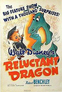
Now, I really, really don't like this new one. I think it's way to bright, but not original enough. The Reluctant Dragon blog layout ought to scream, "Quirky!" and "Unusual!" and "Super awesome!" Not like the last one did, but it was better! I guess I'm just rejecting any hint of change and throwing a fit. Sort of like Pat of Silver Bush, for the minority out there that has actually read that book.
So, I want YOU! (Picture me here pointing a strangely foreshortened arm and extended pointer finger at you while I'm wearing striped pants and a top hat that defies the laws of perspective.)
... To tell me whether I should go back to the old, safe background or stick with this ugly one or get a very scrapbookish looking one.
Please? Pleeease? It doesn't have to be an essay, hey, if you want to, just write "ew" in the comment section if you don't like this new template.
So, comment! (And thanks to all of you who commented last time.)
Uprooting
11 years ago


6 COMMENTS:
Ophelia I like it but do some thig more... well Ophelia. Come on I no you can! ;)
Scrapbook! Scrapbook!!
I agree, scrapbook!
ash<><
I think plain-Jane is the way to go. After all, you want your blog to be about you and your writing, don't you? You don't come into my house to sit and enjoy the wallpaper, but to sit and enjoy MOI! :-)
(Just to muddy the waters a bit more!)
Mrs. E...
I think Karen has a point, dear. In fact, when some people have such interesting houses, it's hard to do anything but look around at their stuff. I didn't like the white, but I do like the green (surprise, surprise!).
Love,
your mother
Ophelia (if that IS your name),
I think your blog's awsome. I like to read it.
Hamlet aka Jake K.
Post a Comment